Appearance
Translations, theming and RTL
Translations
English (en) and Arabic (ar) ship with the package. Each is one file, media-library.php, in the filament-media-library namespace.
Publish them to edit the wording:
bash
php artisan vendor:publish --tag=filament-media-library-translationsThe files land in lang/vendor/filament-media-library/{locale}/media-library.php. Laravel merges your copy over the package, so you can keep only the keys you change.
Add a language
Copy the English file and translate the values. Keep the keys, the :placeholders and the pluralisation syntax.
bash
mkdir -p lang/vendor/filament-media-library/fr
cp lang/vendor/filament-media-library/en/media-library.php lang/vendor/filament-media-library/fr/media-library.php
Panel users see the library in the locale your app uses for that request. Plural strings use Laravel's {1} … |[2,*] … form, for example item_count. Upload and validation messages live under errors and client, so translators see them in the same file.
Right-to-left
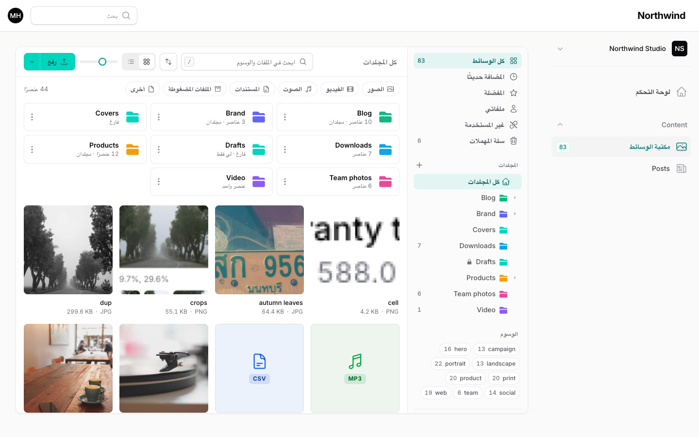
Arabic switches the library to a right-to-left layout with no setup. The layout follows the document direction that Filament sets for the locale, so any RTL locale you add works the same way. The sidebar, breadcrumbs, folder carets, bulk bar and lightbox arrows mirror. File sizes, dimensions and numbers stay left-to-right so they read correctly inside Arabic text.
Theming
The library ships its own compiled CSS, loaded only on pages that use it. You do not add a Tailwind @source line or a @import to your Filament theme.
It reads Filament's color tokens, so it inherits your panel's primary, danger, success and warning colors, your fonts and your dark mode. Primary buttons take their classes from Filament's button color system, so the text color follows Filament's contrast logic for your primary color, in light and dark mode. If you change ->colors([...]) on the panel, the library follows.
Tokens
All tokens start with --fml-. They are declared on .fml, .fml-field, .fml-cell-files, .fml-file-list, .fml-gallery and .fml-field-preview, with dark values under .dark.
| Token | Use |
|---|---|
--fml-surface, --fml-surface-raised | Main and raised backgrounds. |
--fml-rail, --fml-sunken | Sidebar and recessed areas. |
--fml-line, --fml-line-strong | Borders and dividers. |
--fml-text, --fml-text-2, --fml-text-3 | Primary, secondary and muted text. |
--fml-hover, --fml-press | Hover and pressed backgrounds. |
--fml-accent, --fml-accent-text | Accent fill and accent text. Derived from --primary-*. |
--fml-accent-soft, --fml-accent-line | Selected backgrounds and outlines. |
--fml-focus | Focus ring color. |
--fml-danger, --fml-success, --fml-warning | Status colors. |
--fml-shadow-sm, --fml-shadow-lg | Elevation. |
--fml-radius, --fml-radius-sm | Corner radii. |
--fml-tile-size | Grid tile size. Set by the tileSize option. |
--fml-ease | Easing curve for transitions. |
--fml-checker-a, --fml-checker-b | The transparency checkerboard behind images. |
--fml-type-color | Per-file-type accent for badges. |
Override tokens
Add your overrides to your Filament theme CSS. Match the selector so yours wins, and set dark values separately:
css
.fml,
.fml-field,
.fml-gallery {
    --fml-radius: 0.375rem;
    --fml-surface: #fafaf9;
}

.dark .fml,
.dark .fml-field,
.dark .fml-gallery {
    --fml-surface: #0c0a09;
}
To change the accent, change the panel's primary color rather than --fml-accent, so buttons, focus rings and the rest of Filament stay consistent.